Make It Make Sense: What Really Makes a Website Convert

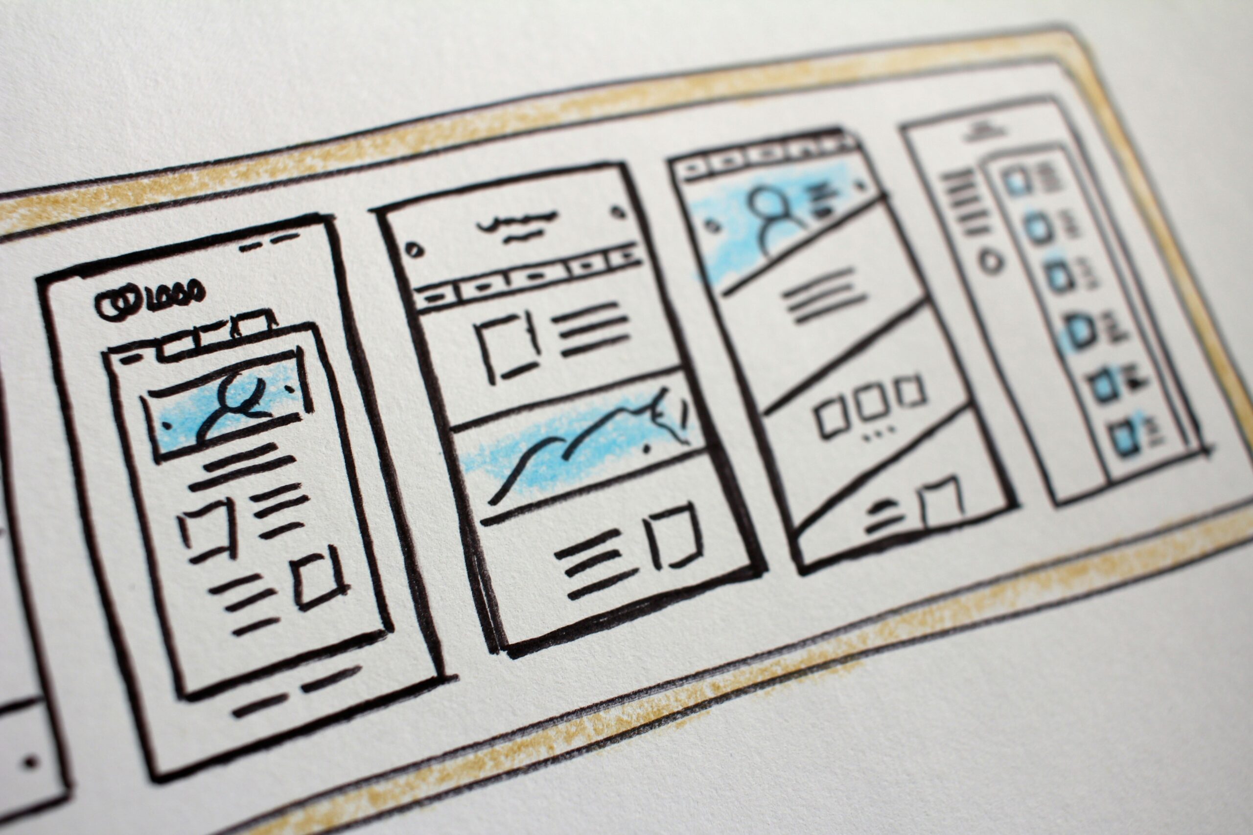
Photo by Hal Gatewood on Unsplash
Let’s be real: having a pretty website isn’t enough anymore. And having a lot of pages won’t save you if the purpose behind those pages isn’t clear.
I’ve worked with enough clients—and taught enough students—to know that most people aren’t actually asking, “How do I make a good website?” They’re asking:
👉🏾 How do I make a website that works?
👉🏾 How do I turn visitors into clients?
👉🏾 How do I help people feel ready to take the next step?
That’s what we mean when we say “convert.” We’re talking about your website guiding someone from curious to committed—whether that’s signing up, buying, booking, or reaching out.
So let’s break down the real things that make a website actually convert.
1. It’s Clear What You Do—Immediately
If someone lands on your site and can’t figure out what you do in 5 seconds, they’re gone.
Your homepage should answer:
- Who you help
- What you do
- Why it matters
- What they should do next
It doesn’t have to be clever—it has to be clear.
💡 Pro Tip: Use a headline like “I help [who] do [what] so they can [benefit].” Simple. Powerful.
2. The Flow Feels Natural
Your site should lead visitors on a journey. Think of it like a conversation:
- “Here’s what I do.”
- “Here’s how I can help you.”
- “Here’s some proof.”
- “Here’s how to take the next step.”
Use buttons (calls-to-action) to guide them from one section to the next. Don’t leave people guessing where to click.
3. Calls-to-Action Are Clear (and Everywhere)
Don’t be shy—people want to be guided.
Add call-to-action (CTA) buttons like:
- “Book a free consult”
- “See my services”
- “Shop now”
- “Let’s work together”
Put CTAs after major sections, in the footer, on your menu bar—anywhere someone might feel ready to say yes.
4. You Speak to Your People
Your copy should feel like a conversation between you and your ideal client. Not a pitch. Not a lecture.
Ask yourself:
- What are their problems?
- What do they want?
- What language do they use?
When your website talks to people instead of at them, conversions follow.
5. It Loads Fast and Looks Good on Mobile
I know, it’s not the sexy stuff—but it matters. If your site takes too long to load or looks janky on a phone, people bounce.
Use tools like Google PageSpeed Insights to test load time. And always preview your site on a phone before you hit publish.
6. You Have Social Proof
Testimonials. Case studies. Logos of clients or press features. Even a simple quote from a happy client goes a long way.
People need to see that someone else trusted you first.
7. The Design Supports the Message (Not the Other Way Around)
Good design doesn’t mean fancy. It means intentional.
Whitespace, readable fonts, clean layouts—all of that lets your message shine.
And remember: your visuals should guide the eye toward action. Not just “look nice.”
Final Thought:
At the end of the day, your website is your digital home. And just like a real home, it should feel welcoming, functional, and built with you in mind.
Conversion isn’t about pressure. It’s about connection. When people feel seen, supported, and clear about what you offer—they’ll want to stay.


